
Make the offer clear before asking for attention
When I review a website, I start with what a new visitor can understand from the opening screen. What does the business do? Who is it for? Where does it operate? What can someone do next? The words should answer those questions without depending on a long animation or a visitor reading every section.
A useful opening describes the work in terms customers recognise. Follow it with a small amount of relevant context and a clear action. Keep the wording aligned with the page that brought the visitor there. Someone arriving from a particular service advert should not have to search the whole site to find that service.
This does not mean making every page look the same. The offer decides the content. A venue business needs to explain the event and planning context; an academy needs to explain the learner’s starting point. Good design gives that information a clear order and makes it comfortable to read.
Build pages around the decisions people make
A homepage can introduce the business, but it cannot carry every detail equally well. Give important services their own pages when they answer different questions. Use familiar labels in the menu. Link related pages in the body so someone can move from a broad overview to the detail that matters to them.
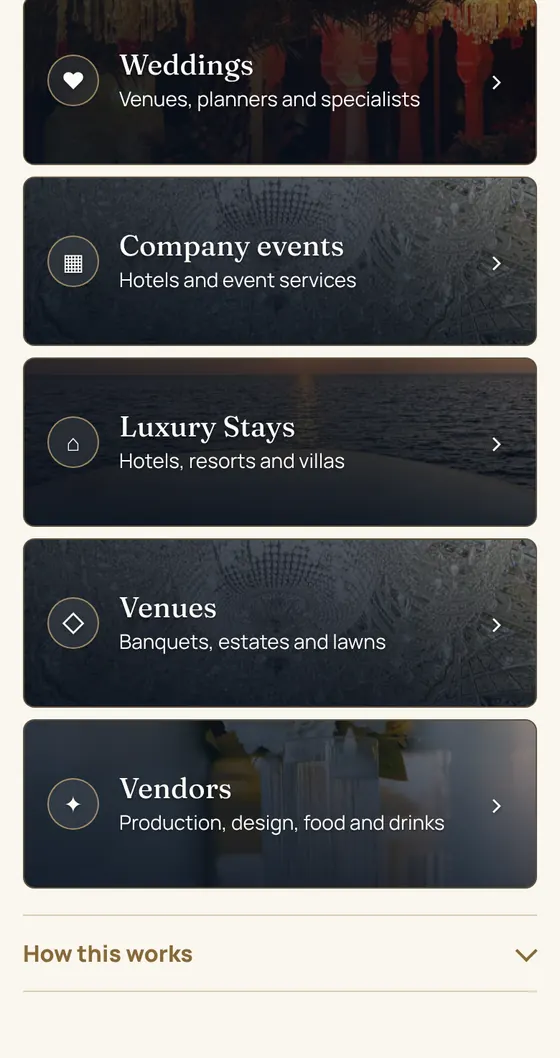
For Zarastays, I built a digital presence connecting corporate events, weddings, venues, vendors and stays. The public website explains the offer and provides routes into the planning and partner portals. Those routes represent different intentions, so they need different explanations.
For Sagechord, the journey connects free learning with programme information and enquiries. The live academy website includes a Find my path planner and Fix My Mix track review. The page structure follows what the visitor is trying to do.
Use proof that a visitor can understand
Show the work relevant to the service you are offering. A portfolio image needs context about what was built. A case study should explain the responsibility, the components and how they fit together. If a result is available, it needs a clear source and enough context to understand what it measures.
The Zarastays planning interface makes the different enquiry categories visible. Sagechord’s free lessons let a learner experience part of the teaching before asking about a programme. These examples show what exists and how a visitor can use it. Their usefulness does not depend on a made-up conversion figure.
Keep testimonials in the client’s own words and use the agreed attribution. Avoid decorative claims that cannot be checked. If your business is new, explain the service and show relevant work honestly. People can assess a clear example more easily than a page full of broad promises.
Choose a clear next step for each page
Decide which action best fits the visitor’s position. They may need to request a quote, book a conversation, start a lesson or send a planning brief. Use a label that explains what will happen. Keep the main action visually clear and make other routes easy to understand without crowding the page.
A contact form and a messaging option can serve different preferences. The surrounding copy should make their purpose clear. If a visitor chooses the form, explain the response they can expect. If they choose a booking link, tell them what the conversation is for and what would be useful to bring.
Follow the links yourself from the beginning of the journey. Check that the destination matches the label and that the visitor can recover if they change their mind. A beautifully styled button still needs to lead to the correct place. The same is true of links in the menu and footer.
Keep forms understandable and dependable
Start with the information needed for a useful reply. Ask only for details that have a role in the conversation. Use visible labels, sensible input types and helpful error messages. A visitor should be able to see what needs correcting while keeping the answers they already entered.
For businesses with different audiences, separate the routes where it helps the response. Zarastays has a planning portal for customer briefs and a partner portal for supplier introductions. The distinction is visible before the form begins. That makes the purpose of the questions easier to understand.
Test what happens after submission as carefully as the form itself. Show a clear confirmation. Make sure the business receives the enquiry and knows how to respond. Provide a contact alternative for someone who cannot complete the form. Keep sensitive information out of public pages and measurement events.
Check the site as a phone visitor
Read the opening, service details and contact route on a narrow screen. Headings should wrap naturally, images should remain useful and controls should be easy to reach. Open the menu, follow an in-page link and return to the page. Check that a fixed header does not cover the section you wanted to read.
Media should support the explanation without delaying it. Give a hero video a still image so the page retains its meaning before playback starts. Keep a motion control available when movement continues. Use image sizes suited to the layout and make room for them before they load.
I also look at whether the right things are the right size. A page can avoid horizontal scrolling while still showing tiny cards or cramped screenshots. The visitor needs to read and use the page comfortably. Review the actual content, including long headings and form feedback, rather than only an empty layout.
Connect measurement with a real reply
Agree how the business will record and handle enquiries. A contact-button click, a completed form and a qualified conversation are different events. Keep them separate when reviewing the site. The person responding can often explain where the wording is unclear or which information would help them reply.
Use those observations to choose a specific improvement. Perhaps a service page needs to explain scope more clearly. Perhaps a form asks for something too early. Perhaps the follow-up process needs a named owner. Change the relevant part of the journey and review what happens in context.
I bring this work together in Digital Presence Build: the website, search foundations, tracking and lead capture. When the main gap is uncertain, a Growth Blueprint can define the priorities first. The written scope sets out the work and the checks so you know what the finished website is meant to support.
Questions, answered.
Does a small business need a large website?
The useful size depends on the decisions customers need to make. A focused site can work well when it explains the offer, provides relevant evidence and makes contact straightforward. Add pages when they answer distinct questions and can be kept current.
Should the homepage have a contact form?
A form can help if visitors are ready to enquire there. Some businesses need service details or a planning route first. Choose a clear primary action, explain what happens next and make the contact route easy to find from every relevant page.
What should I check after a website launches?
Check the live pages, mobile navigation, contact routes, form confirmation and receipt of enquiries. Confirm that tracking distinguishes clicks from submissions. Review new enquiries with the person handling them so you can identify confusing copy or missing information.
Can a redesign guarantee more enquiries?
No. The offer, audience, traffic sources and follow-up all influence enquiries. A redesign should address specific problems you can describe and check. Agree the intended behaviour and use real evidence to decide what to improve after launch.
